
By Chloe-Marie Iskandar
Typography creates meaning, emotion, clarity, design, and identity.
RawView Campaign


Rawview is a campaign that challenges the unrealistic beauty standards created by filters and editing tools. Aimed at Gen Z women, it redefines beauty by promoting unedited, real, and raw self-expression. Through storytelling, posters, social media, public installations, and interactive experiences, Rawview empowers audiences to embrace authenticity over perfection. The campaign shifts the focus from manufactured ideals to celebrating individuality, sparking a wider conversation about self-acceptance and confidence.
Zealand – “Uncovering Your Slice of New Zealand”
This video ad captures the breathtaking beauty of New Zealand, built around the idea that everyone has their own ‘slice’ of the country waiting to be discovered – a place that speaks to them personally. Sweeping landscapes and moments of adventure are woven together to immerse the viewer in both the scenery and the experience. The pacing and transitions mirror the rhythm of a journey, drawing the audience in while subtly engaging their visual senses.
“Coca Cola’s Unexpected twist”- Billboard

The revised Coca-Cola Orange Vanilla billboard takes a cleaner, more sensory-driven approach. Instead of relying on repetitive text, it uses simple, descriptive lines like “A splash of citrus” and “A swirl of vanilla” to highlight the product’s flavour profile. The bold, minimal layout makes the message easy to read, while the tagline “Refreshingly Unexpected” reinforces the uniqueness of the flavour combination. This straightforward execution gives the billboard stronger clarity, a more memorable identity, and a more engaging emotional connection with the audience.

“What I’ve Done in April” illustrations
What I’ve Done in April is an illustrated diary that visually documents the small moments and emotions of my month. Using a playful black-and-white style, I combined hand-drawn typography with expressive doodles to capture a mix of everyday experiences - from the stress of university and oversleeping alarms to lighter moments like dance class, music, and enjoying food. The work turns ordinary routines into a whimsical visual narrative, showing how illustration can communicate both personality and mood in a simple, engaging way.
“Dove” - Social Media Campaign


This Dove social media campaign, Unfiltered Beauty, celebrates authenticity by rejecting digital perfection and embracing natural skin. The visuals spotlight unedited portraits that reveal acne, freckles, and texture, paired with bold statements that challenge the pressure to retouch. By using simple layouts, muted tones, and powerful typography, the campaign reframes so-called imperfections as normal and beautiful. It reinforces Dove’s long-standing mission to promote self-acceptance while inspiring audiences to embrace unfiltered confidence in the age of social media filters.
“EcoMate” - Social Media Campaign
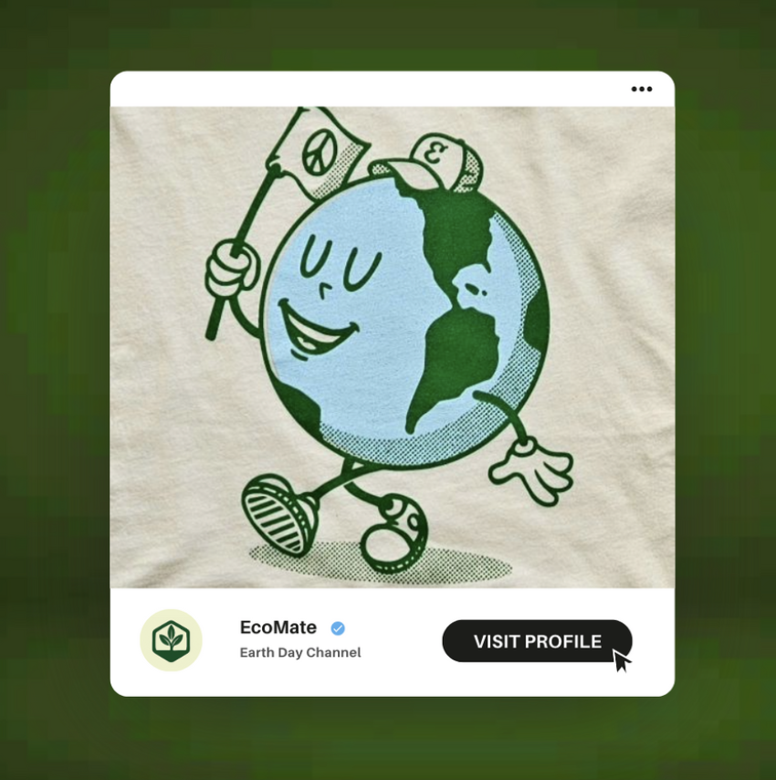

These EcoMate social media mock-ups are designed to inspire sustainable action in a way that feels fresh, fun, and approachable. Using a clean visual style with bold greens, simple icons, and motivational phrases, the posts frame eco-friendly habits as small, achievable steps that can be celebrated and shared online. The content avoids heavy, guilt-based messaging, instead tapping into a youth-driven tone that highlights progress, positivity, and community. By combining visual consistency with playful storytelling, the mock-ups demonstrate how EcoMate can build an engaging digital presence that motivates young adults to see sustainability as part of their everyday lifestyle.

ABW - Poster

VivaCore - OOH

Amazon - Poster


